
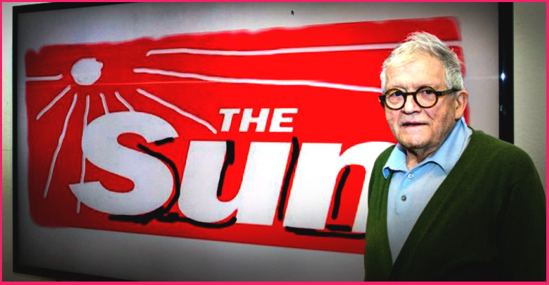
Last week, The Sun enlisted none other than David Hockney to redesign their paper’s masthead, for a one-off edition.
Possibly the most famous British Pop-Artist alive today, has added: black shadows and sun rays to an otherwise untouched, typographical logo!
The Sun may not be your stereotypical art-lover’s newspaper of choice, so does this unlikely marriage bring (the otherwise inclusive, elitist world of) art, to the people?
It’s also reminiscent of the Imperial Japanese battle flag of the 1940s, possibly an in-joke at the Murdoch-owned tabloid?
The truth is: The Sun doesn’t normally mind / care what type of publicity it receives. In this case, (like all good art, and all good marketing) people are talking about it.
Love it or loathe it, this redesign seems to be one of two things:
- A sly dig (or two) at The Sun’s expense,
- A canny artist cynically cashing-in, with minimal effort.
…or both.
The art-world is often accused of taking itself too seriously, the same can’t be said about a 79 year old man’s iPad sketch.
Has this David Hockney made a splash with you?
Image: The Sun
Leave a Reply